Monday, December 7, 2009

Eve Group


This is a poster for the Eve Group Co., Ltd. This has a very dynamic layout because the big tree is off center and the type is on it's side. I think the quality of the illustration on the tree is very good. The red and black color scheme is nice. The designer did a great job with the negative space on this poster. I think it is advertising a sale, but I'm not sure how the tree relates to a sale. I found this in the Type Directors Club Annual 28.

Sunday, December 6, 2009

Fresh Diaogue


This is a poster for the American Institute of Graphic Arts. It definitely looks like water for the letters, but I'm not sure if it is real water or computer generated water. I like this design because it has good placement, and it is creative. The small words are hard to read, but it still looks awesome. This is in the 28th TDC Annual.

Tuesday, December 1, 2009

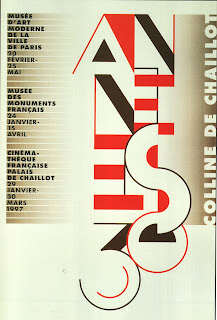
Les Annees Trente


When I first saw this I thought it reminded me of early modern and art deco designs, and then as I read about it, I found out that it is a poster for a series of exhibitions and a film festival about the 1930's. That is the same time as those styles, so I think the retro idea makes it a good design. The typeface is Bifur and Revisiting Type.This image is from Cool Type 2wo.